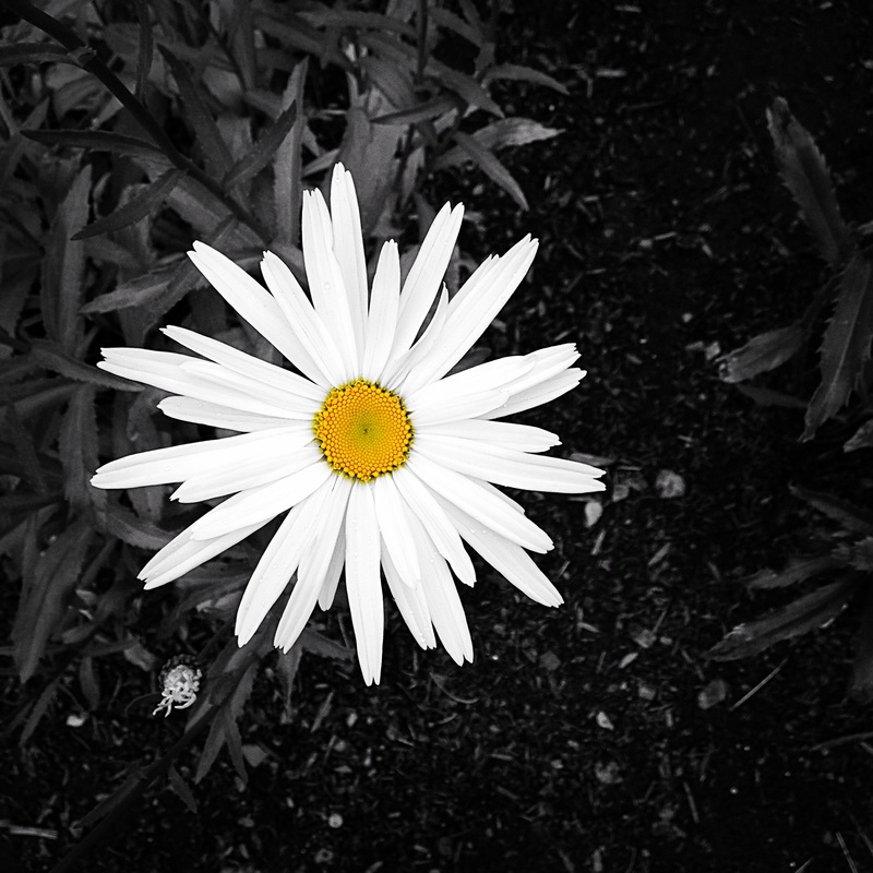
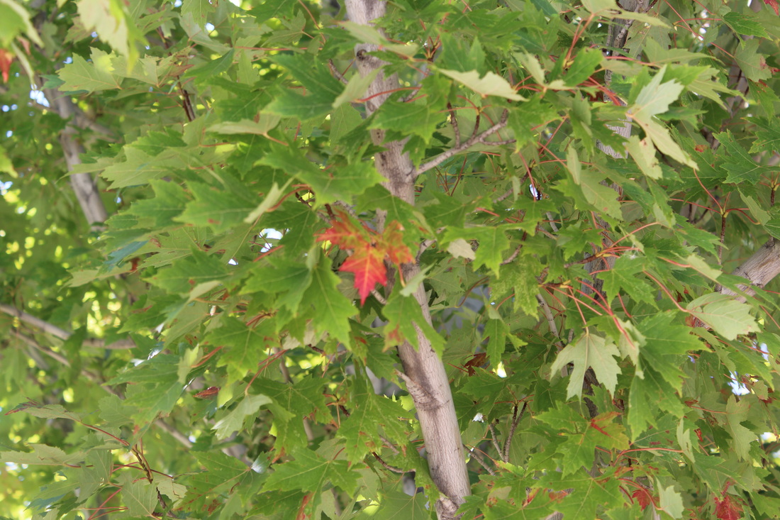
The images below are the work of Ansel Adams. His work consists mostly of black and white nature and landscape images. These are two of my favorite pieces because they both have contrast in textures rather than color. I also really like the value in the first image where the rocks move darker and darker until they are the mountain. The composure of both images is very good as well. In the second image The main leaf is not directly in the centre and there are more leaves in order to take away negative space. The fill of the frame is also very well done in the second image.
Below is an example of a portrait. This is not a very good example of a portrait, but it has some aspects that are good. There is light in both eyes, and the subject is the focus of the image.
The subject's head could be turned towards the camera in order to create some shadow and make the light less harsh. I could have moved closer to the subject in to isolate her face more. The background could have been blurred more so as to emphasize the subject more. Based on the article we read in class today, composition is the way an image is framed in order to make it interesting to the viewer. I learned that poor composition can make an image very dull and static. I also learned that you want to simplify your image, this can be done by filling the frame completely. Diagonal lines are more appealing to the eye than horizontal or vertical lines, but all lines have a purpose when it comes to sharing a message within your photograph. I learned that you shouldn't center the subject, but you don't have to follow the rule of thirds all the time. Most importantly I learned that these rules are meant to be broken with spectacular photographs that can't be anything more than an exception. However, these rules should only be broken one at a time. Below I am showing the different aspects of composition in one of my own photographs. There will be some things mentioned there that are not present her, these are things I also learned today.
After reading the article and practicing I have noticed that the composition of a photograph is very important. The images below are composed well. The focus is not in the center of the image, the backgrounds don't distract from the subjects. There is value in the leaves of the tree and contrast between the colors in the portrait. One rule I did break however, is the space to move. In the portrait, Katie is looking to a point that is not in the frame. This gives viewers a sense of unease, but the flowers in the background help to balance this. The image on the left is an example of poor composition. The image could be very good, but the emphasis is right in the middle of the frame, and there is much too much negative space within the leaves around. To the right is what could be done with the image to make it better.
Mario Testino is a fashion photographer. He was born in Lima Peru in 1954. His work has been featured in Vogue and he represents brands such as Burberry, Chanel, and Gucci. As a child, Testino went to Brazil during the summer to get inspiration, and his work also seems to be inspired by the work of British fashion photographer, Cecil Beaton. His work is interesting. All of his portraits show people in a way that both tells a story and shows off the work he is trying to promote. Many of his portraits are women, and in most of the images the hands of the subject are visible and being used. His work is kind of weird and I'm not sure if I like it, I did find a few images I think are interesting. They are below. These are some of the less weird images. I found that a lot of Mario Testino's work didn't make a whole lot of sense to me and I didn't find it as interesting. I like these two images because they show women in "typical" settings but not acting typically. The first image I really like, because it seems to show the burden of being surrounded by men and having to act a certain way when you have not interest in your surroundings. The second image I like because while she is in a dress and in a ballerina-like pose, based on her body position, the subject looks like she is relaxed because she is thinking about something else. I find his work interesting based on the stories created, but I'm not sure I like all of it.
Both of these images are photographs from Lewis Hine's collection. While most of his photos show the horror of child labor, I think they, especially these two, have a subtleness of what the society was like while this was going on. In these images, it's not obvious these children are labor workers, but you can see what kind of society these children are living in. In both of these images, the children are looking and acting like adults. I really appreciate the subtleness of these images because it is so interesting to see the challenges of a community without being blatently obvious.
|
AuthorWrite something about yourself. No need to be fancy, just an overview. Archives
May 2016
Categories |